09 Maison des épices
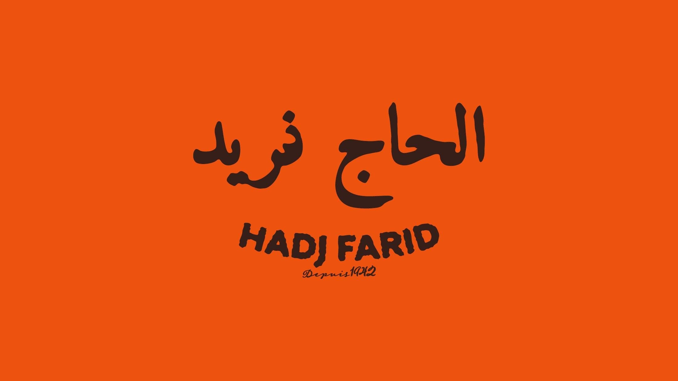
A family grocery in Kenitra, since 1942.
Hadj Farid, Dar attawabil, the house of spices, wants a modern image that still respects its local roots and neighbourhood values.
Rejuvenating the brand, so the shop becomes a house that lasts and carries on to the next generations.
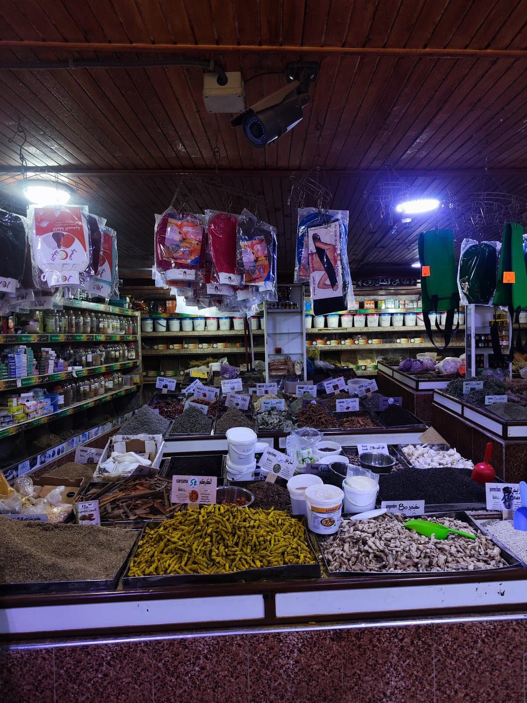
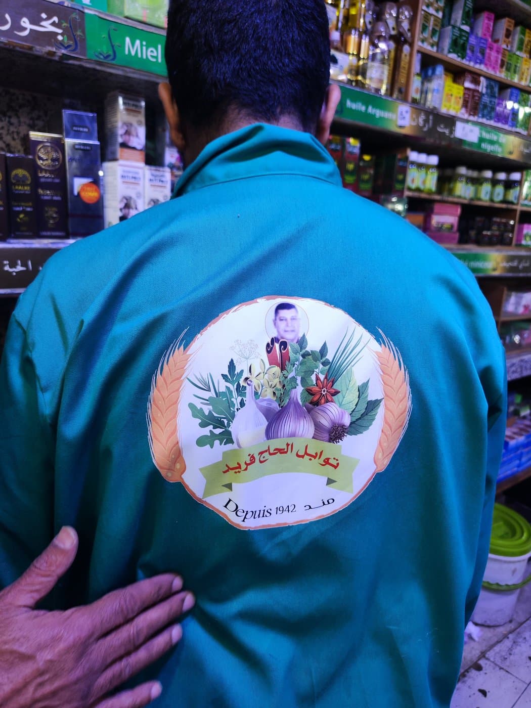
Starting from the shop.
Preserving the authenticity of the house: modernising it without distorting it, or giving in to the codes of a trendy urban aesthetic.
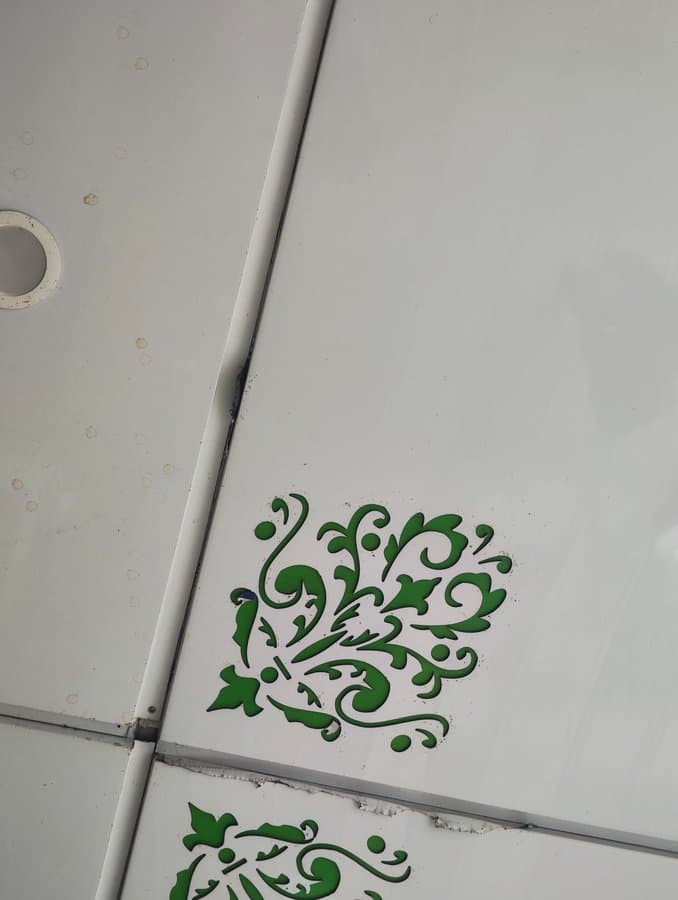
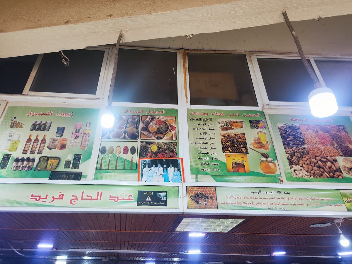
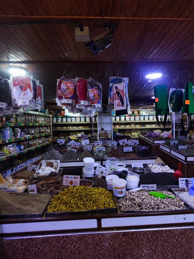
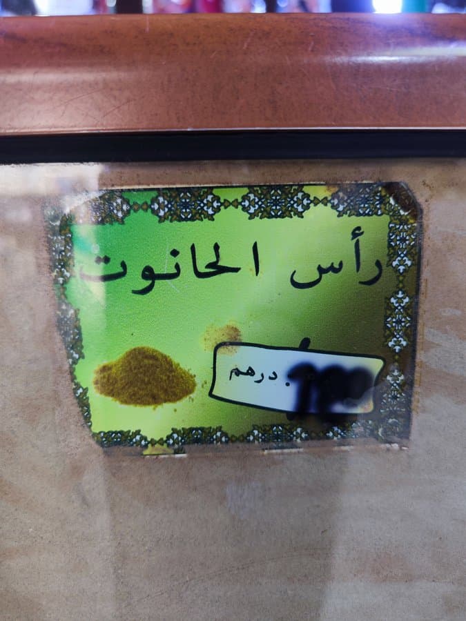
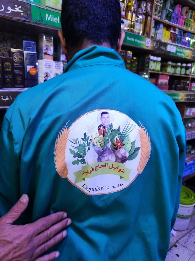
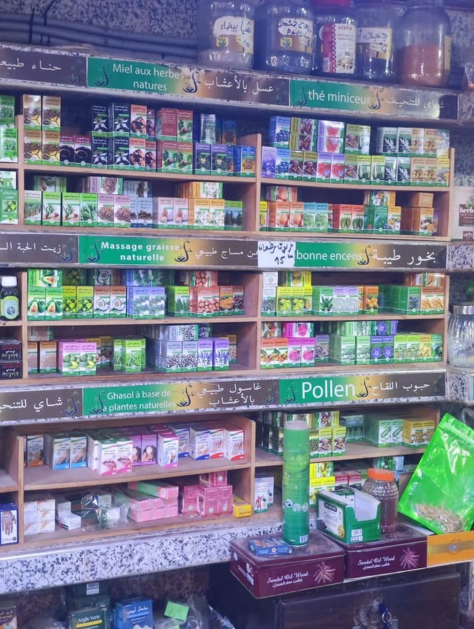
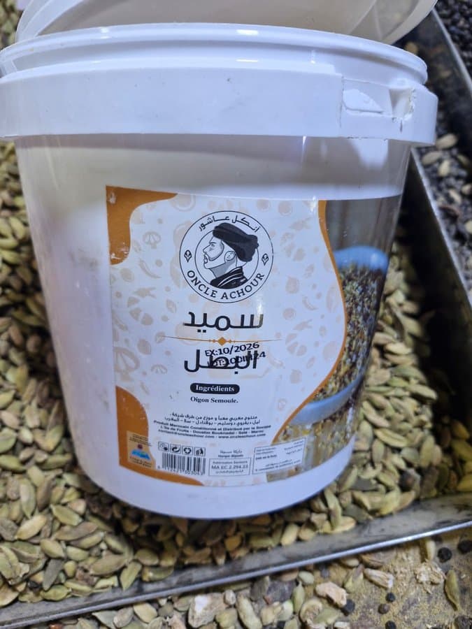
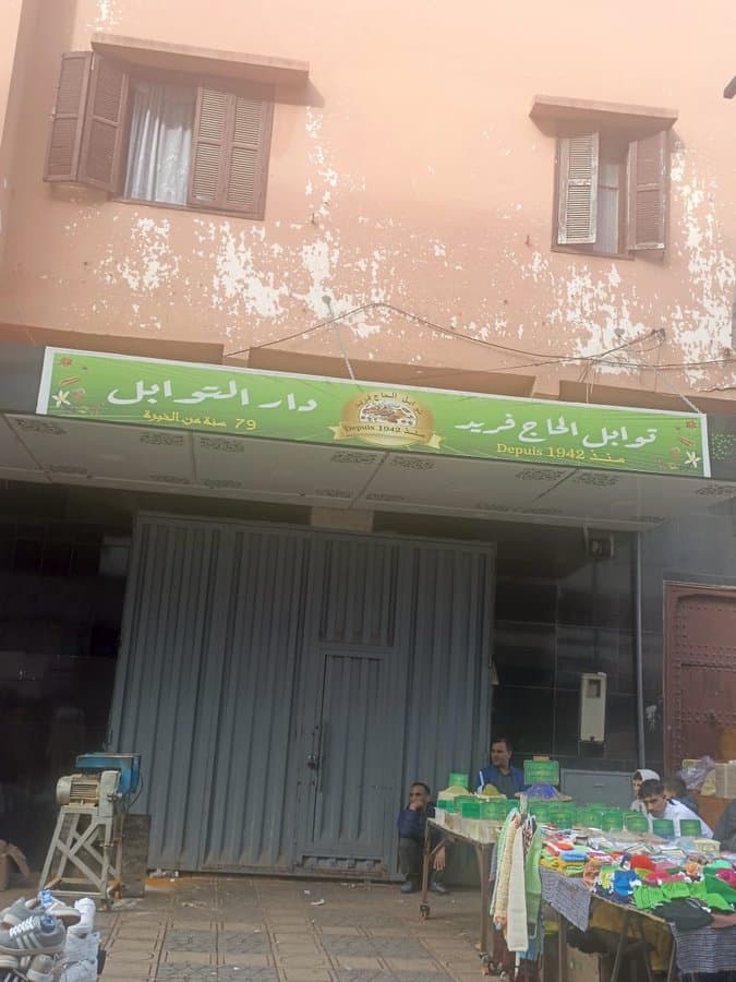
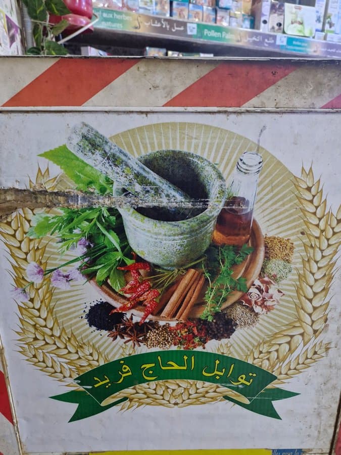
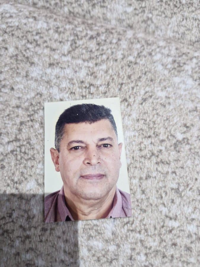
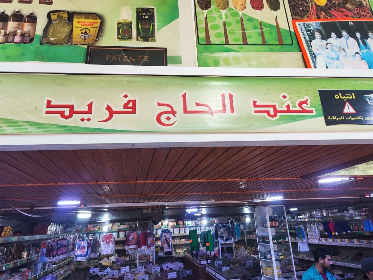
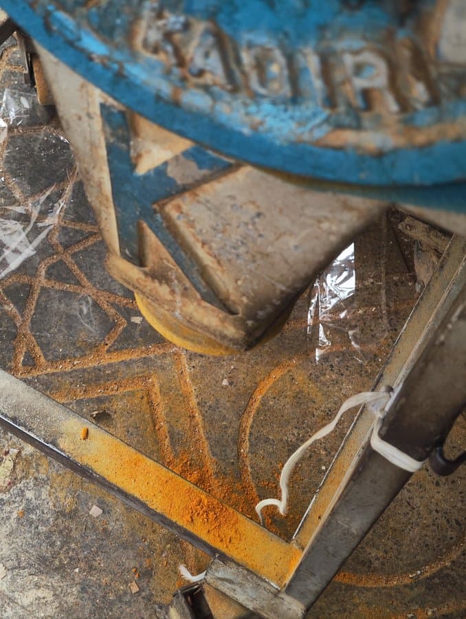
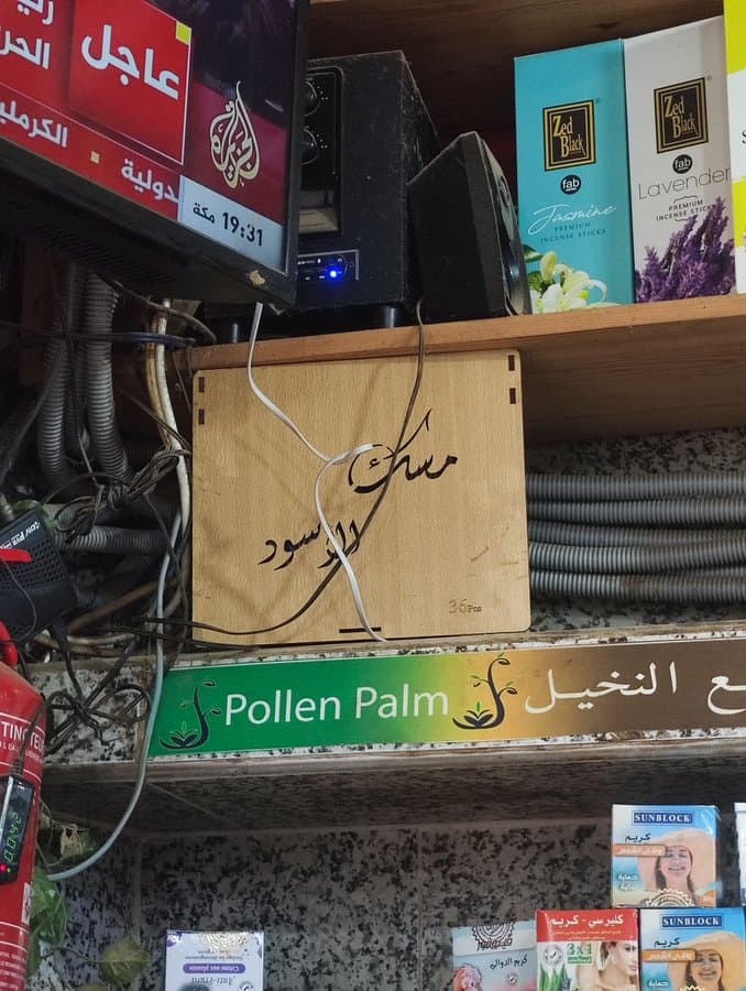
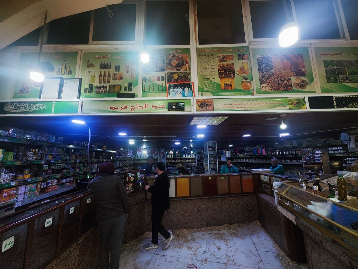
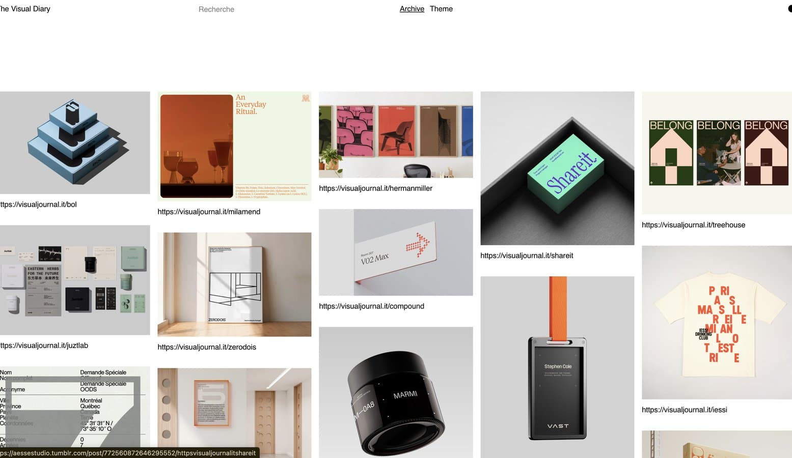
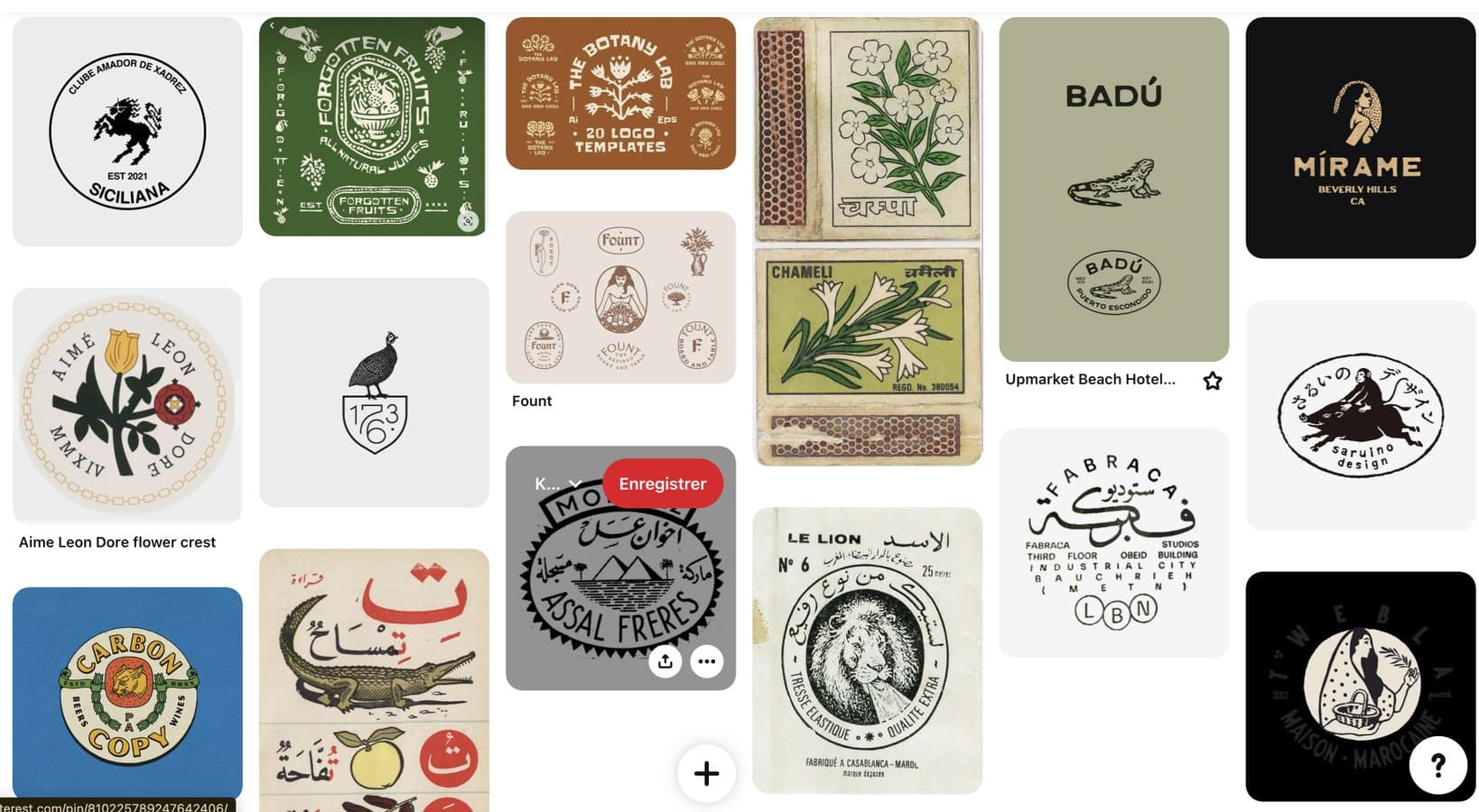
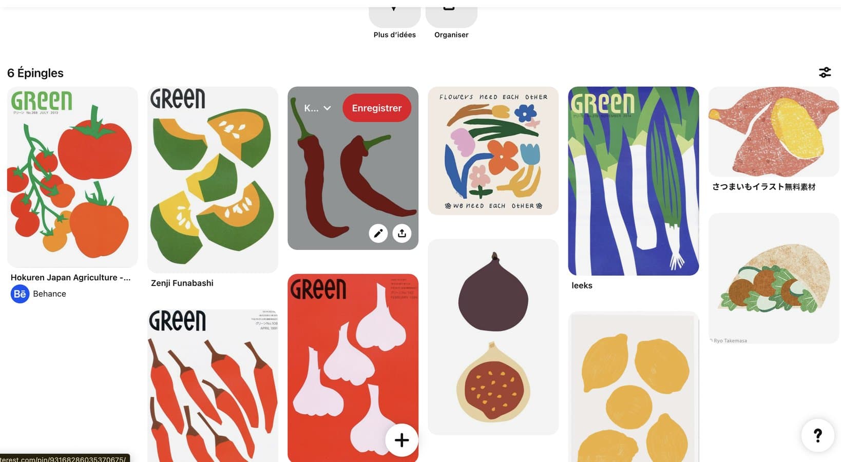
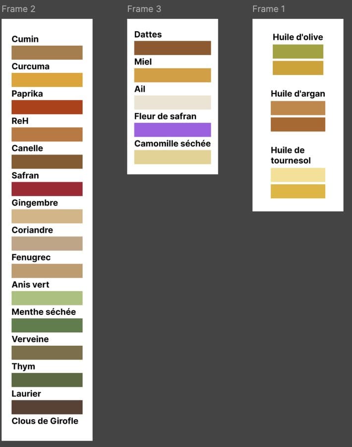
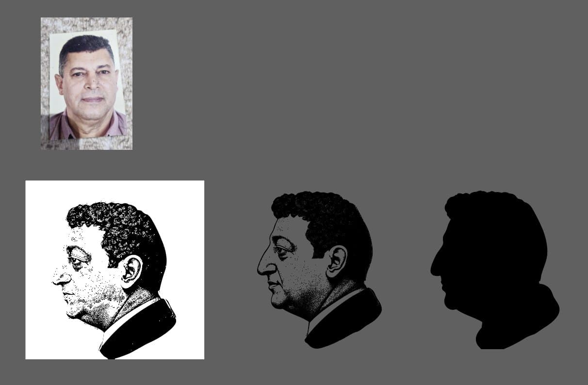
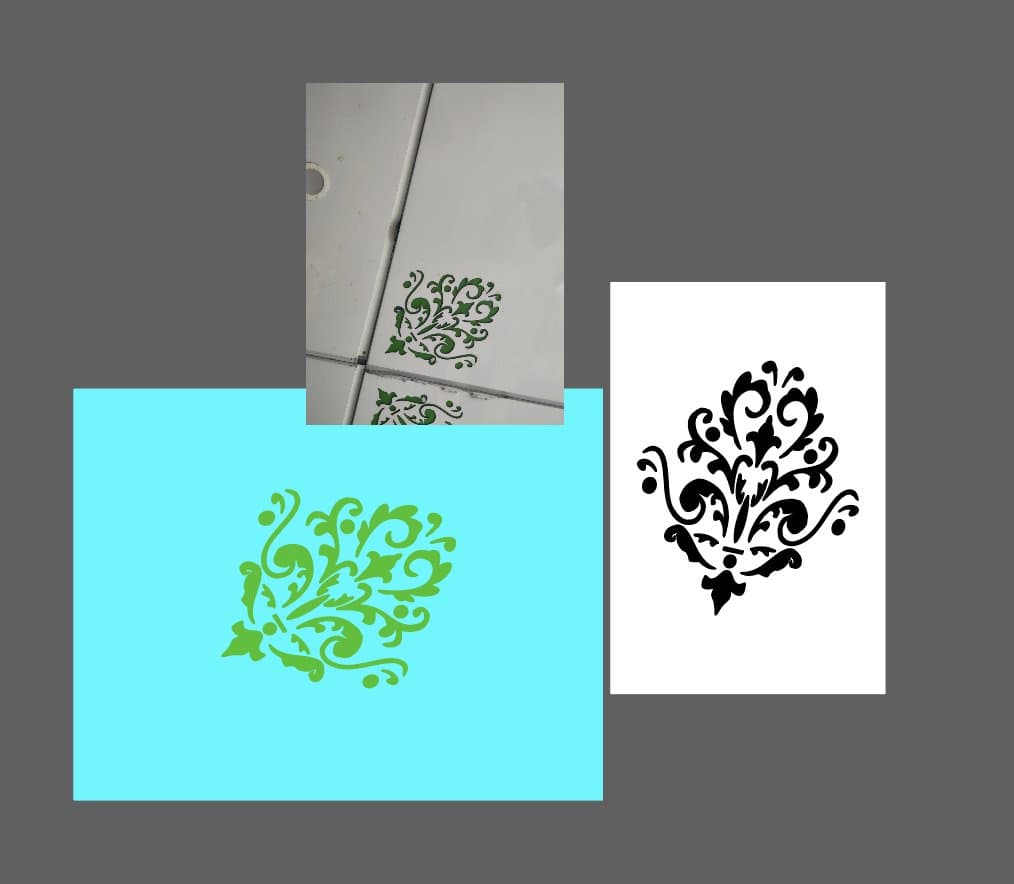
A portrait seal and the colours of the counter.
The logo routes start from the portrait, treated as a seal. The palette comes from the spices themselves, around a bold orange.
The idea: a sign like the ones on 1940s spice and oil houses. I take their roundel, with the shop’s founding date, and it becomes the new identity. The colours stay very organic.
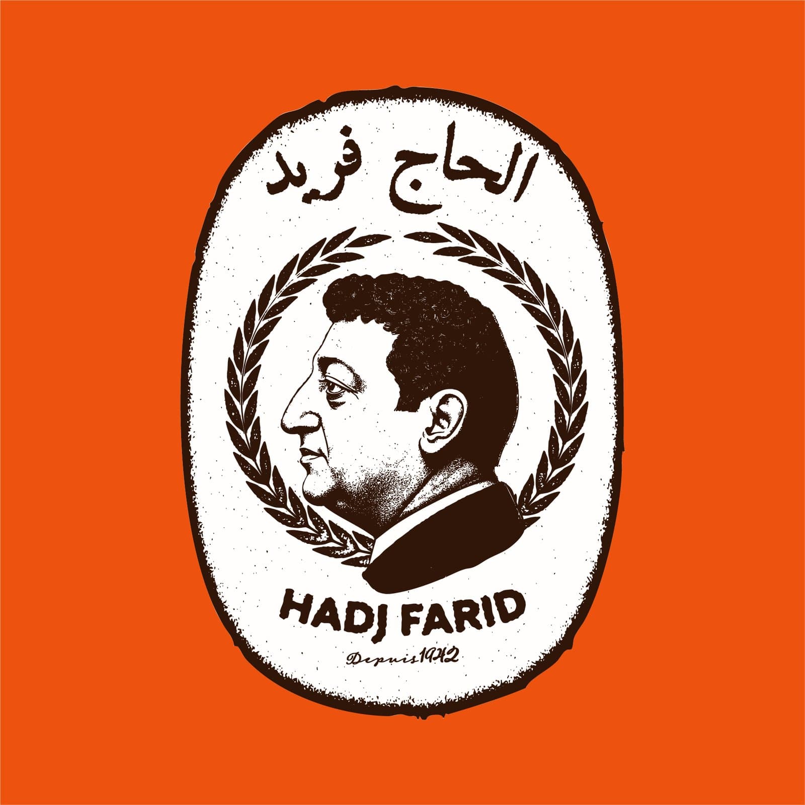
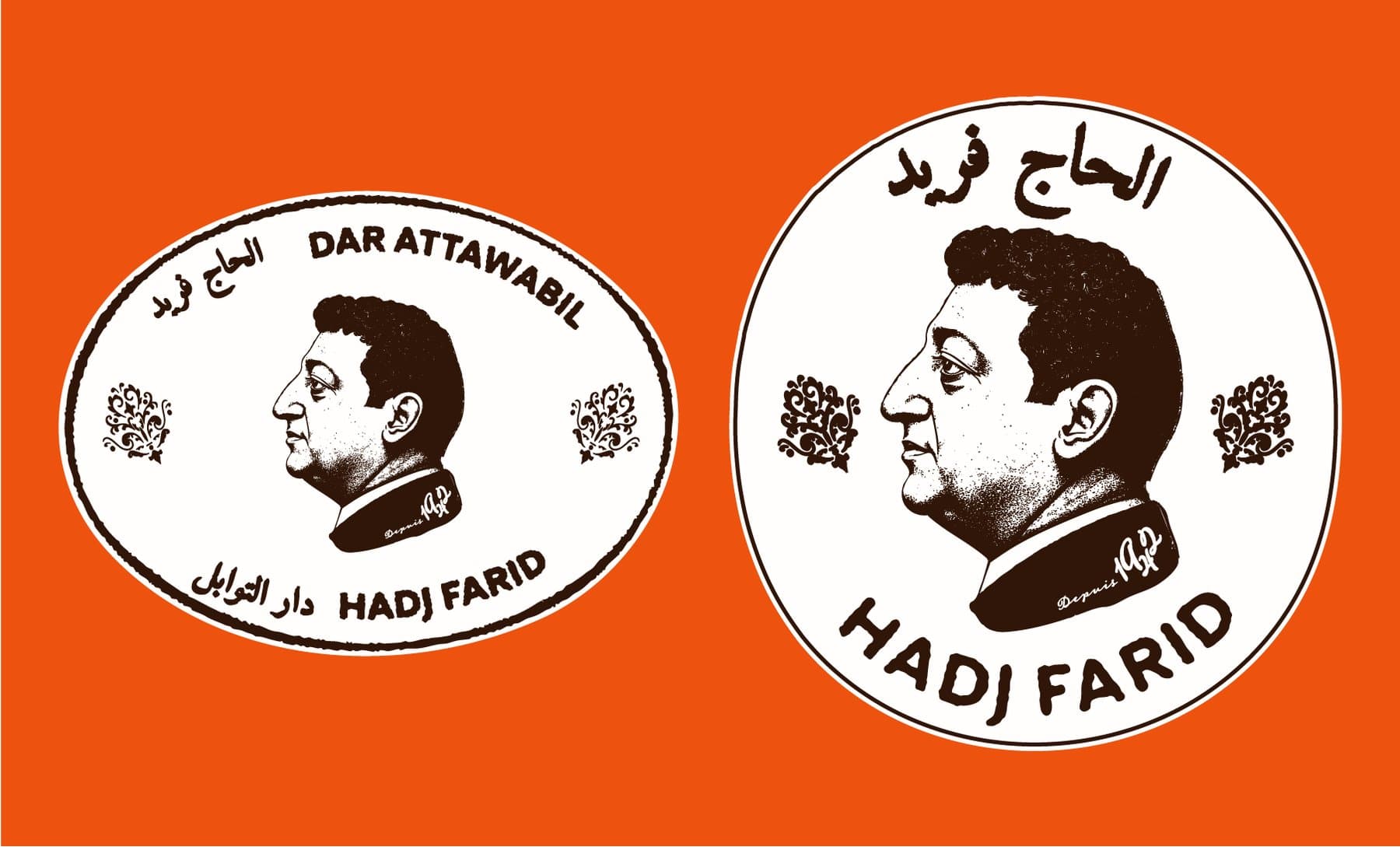
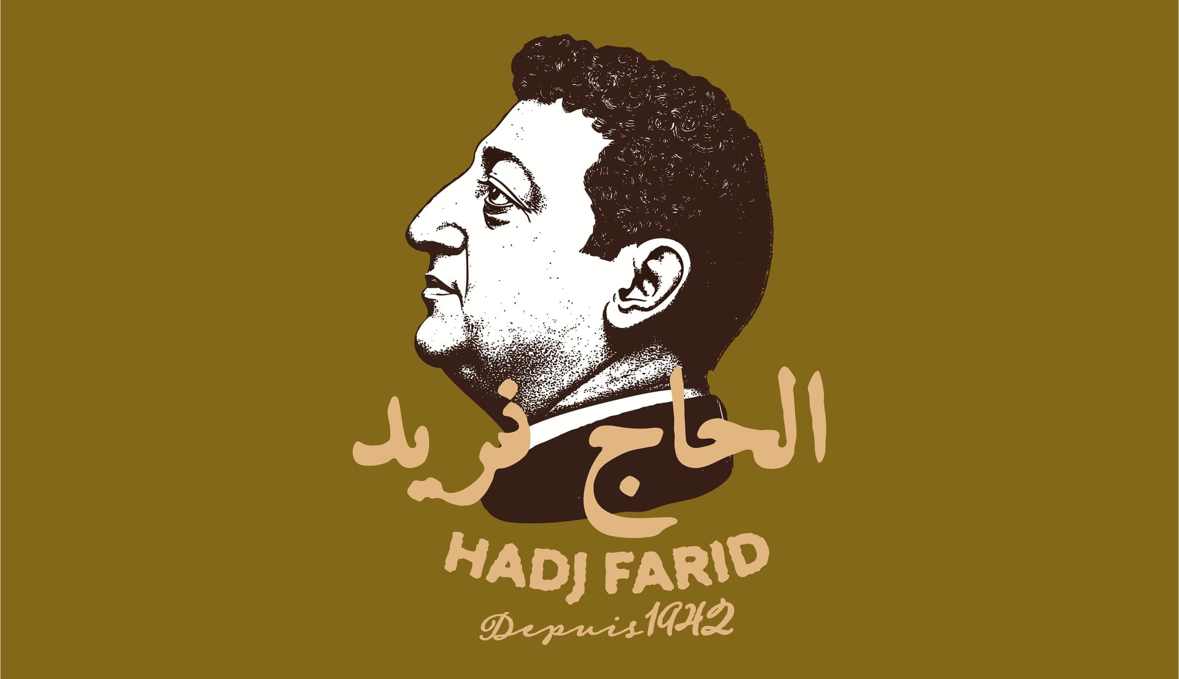
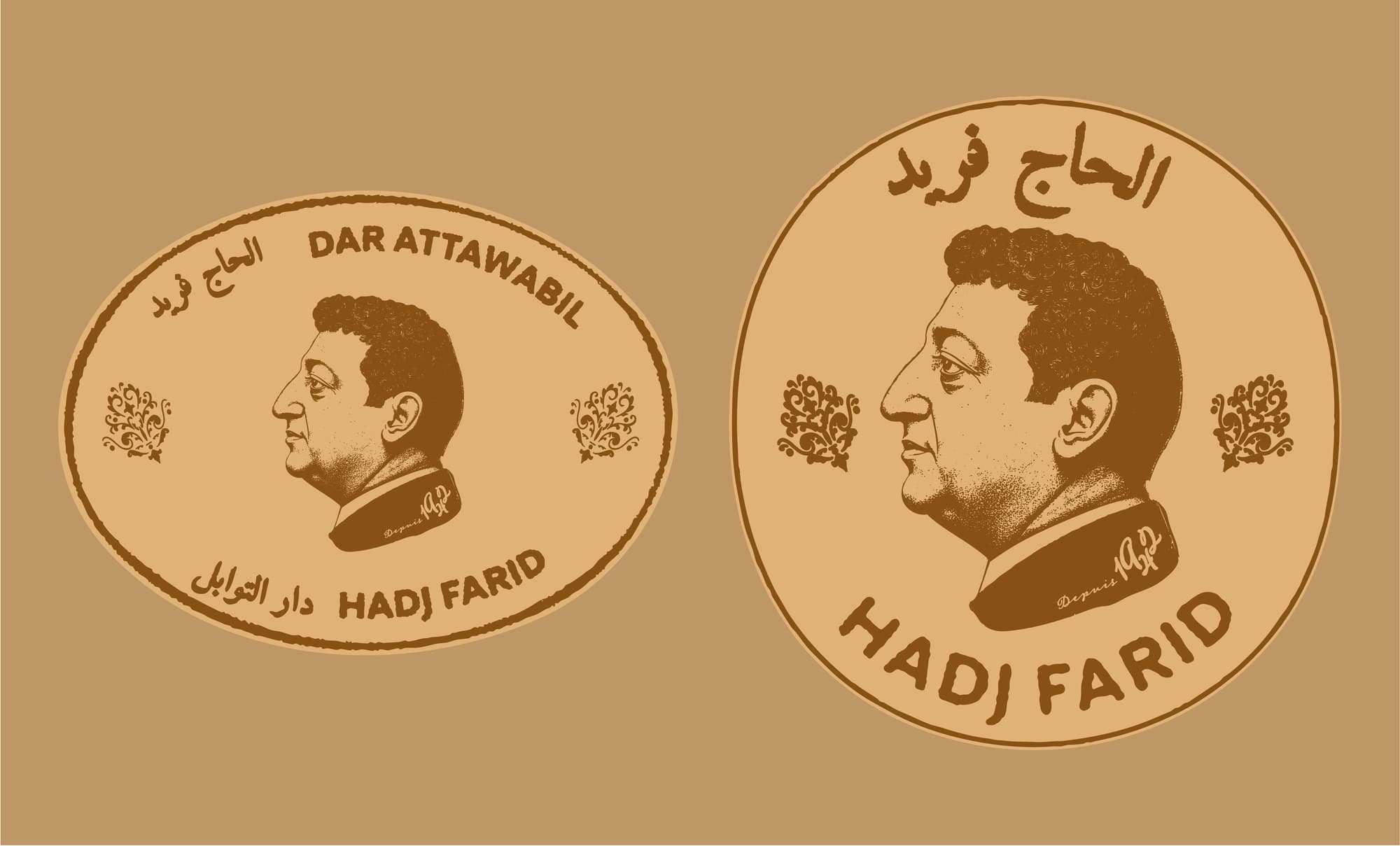
The seal, on the jar and on the shop sign.
Mock-ups to see the identity in place: the shop sign, then the jar with its seal strip.

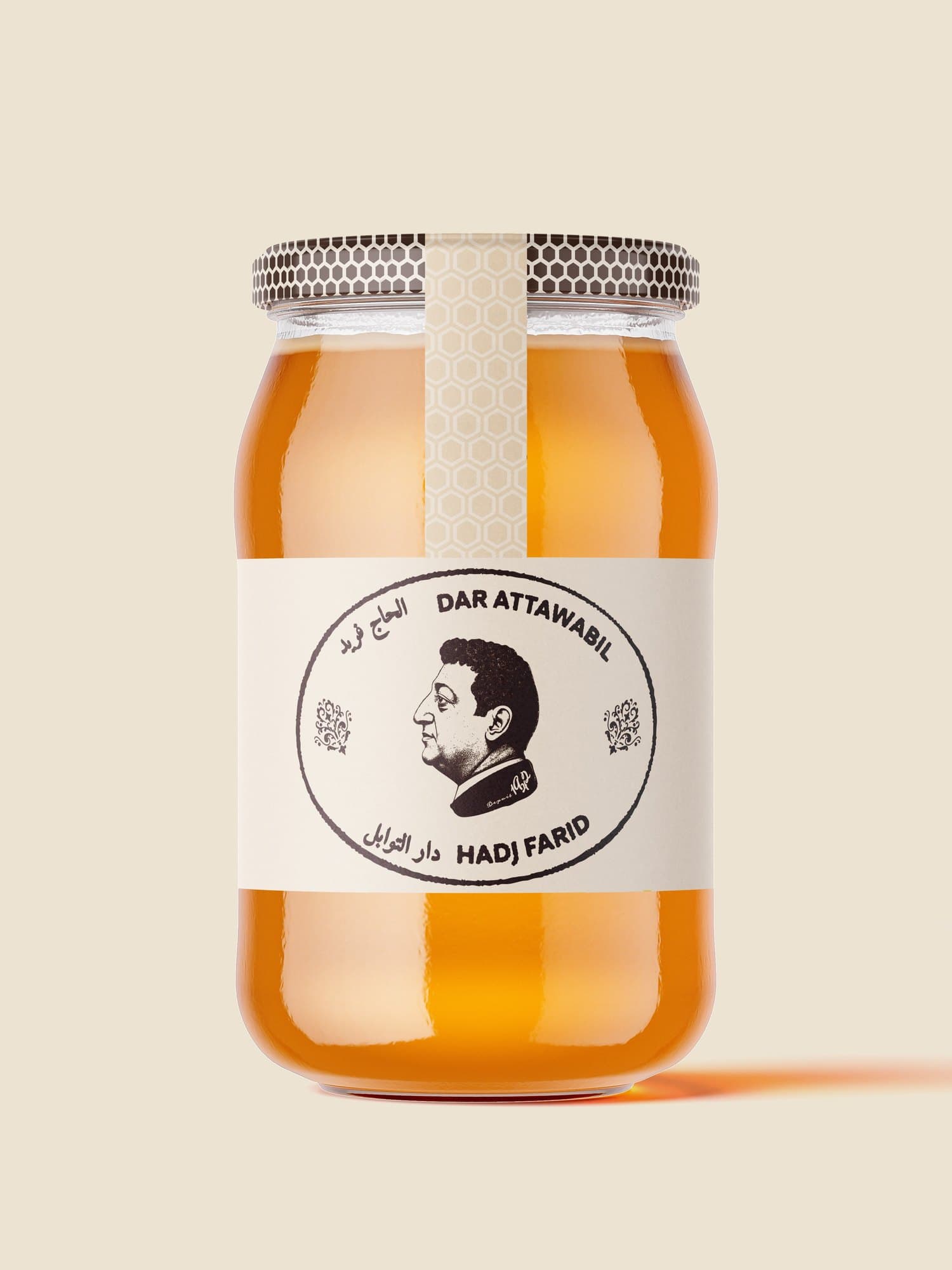
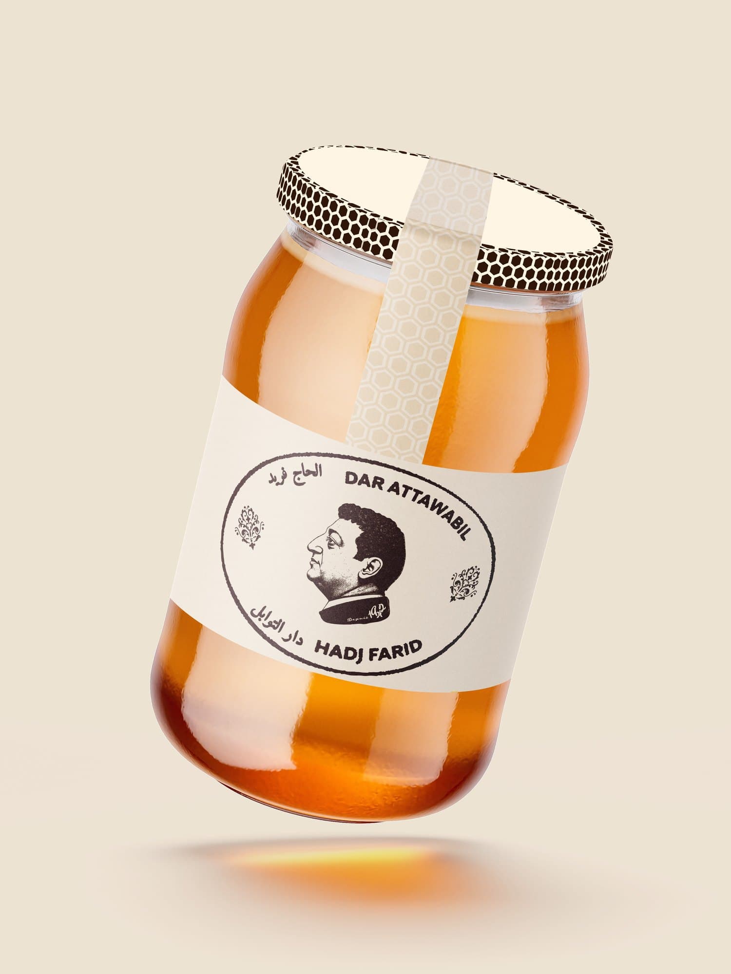
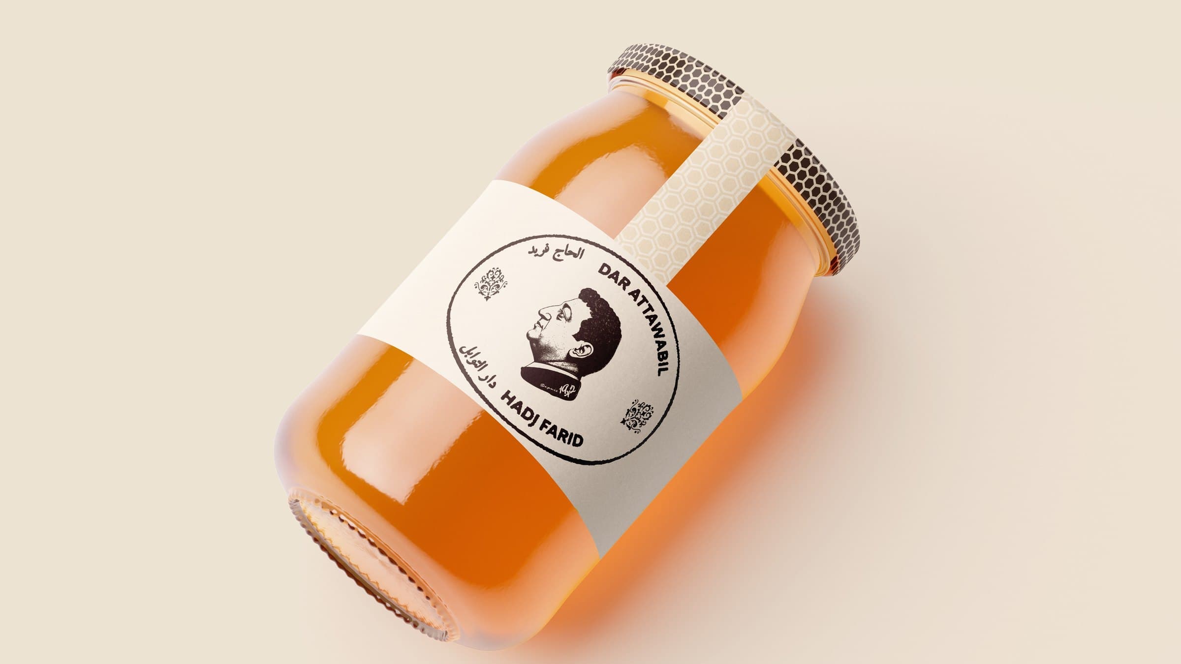 Shop sign · jars
“A brand that makes you hungry.”
05 Smaak →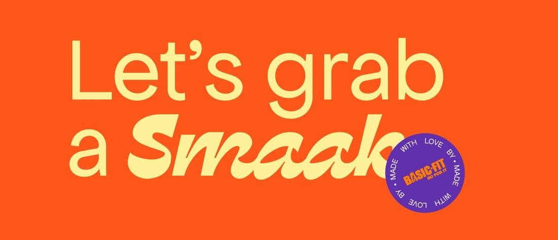 05
 01MONIOver a million users: bringing the app closer to its diaspora.
 02SorareThe European Nights trailer, built around Zinédine Zidane.
 03mym × Venus 202710 creators in chrome, from concept to the trade-fair booth.
 04MyShelfScore (Voodoo)The “calorie tracker” for skincare: angle, Meta ads, funnel.05SmaakThe athletes’ grocery store, right inside Basic-Fit clubs.
 06PitchyPRO BTP, Anses, Warwick: three films, three motion styles.